Advertisement
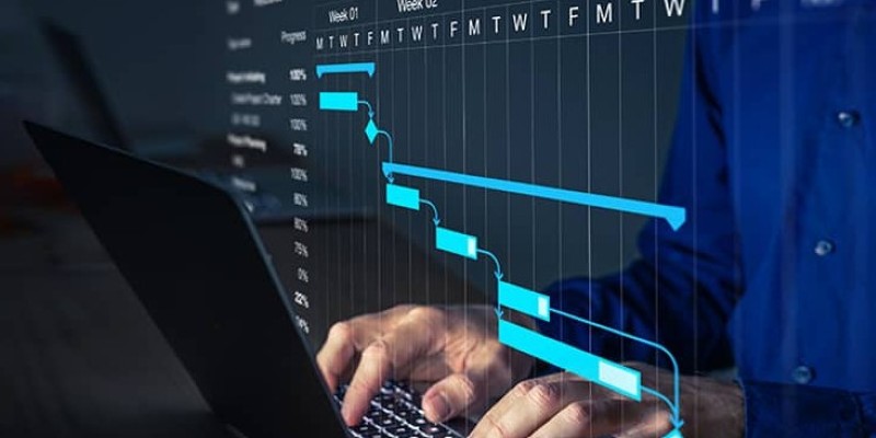
Managing tasks can sometimes feel like juggling too many balls at once. When deadlines start to overlap and priorities shift, it’s easy to lose track of who’s doing what and by when. That’s where a Gantt chart comes in handy. It lays everything out visually, making it much easier to spot bottlenecks and set realistic timelines. And guess what? You don't need expensive software to create one. Python can handle it for you – and it’s way more flexible than you might expect.
Gantt charts aren’t just fancy schedules. They map out project timelines in a way that’s clear at a glance. Every task gets a horizontal bar that shows its start and end date. When you line everything up, it’s easy to see overlaps, gaps, and dependencies.
For teams, this means fewer misunderstandings and less scrambling to catch up. For individuals, it offers a simple way to stay focused without constantly flipping through to-do lists. The best part? You can tweak them easily when plans change – and let’s be real, plans always change.
Whether you're organizing a full product launch or just trying to clean up your workflow, having a visual timeline makes life a whole lot easier. And when you create one with Python, you aren’t boxed into templates or features you don’t need.
You don’t need to be a professional programmer to build a clean, useful Gantt chart with Python. A few well-chosen libraries can do the heavy lifting for you. Let’s go through the basics.
First, you’ll need a few libraries installed. Here’s what you’ll be using:
Installing them is simple:
bash
CopyEdit
pip install matplotlib pandas plotly
Once you’re all set up, you can start shaping your project data.
Your data should include:
In Python, it usually makes sense to organize everything in a DataFrame. Here's an example:
python
CopyEdit
import pandas as pd
data = {
'Task': ['Research', 'Design', 'Development', 'Testing', 'Launch'],
'Start': ['2025-05-01', '2025-05-05', '2025-05-10', '2025-05-20', '2025-05-25'],
'Duration': [4, 5, 10, 5, 1] # Duration in days
}
df = pd.DataFrame(data)
df['Start'] = pd.to_datetime(df['Start'])
df['End'] = df['Start'] + pd.to_timedelta(df['Duration'], unit='d')
Now, you've got a structured layout that's easy to plug into a chart.
Here’s where it all comes together.
python
CopyEdit
import matplotlib.pyplot as plt
fig, ax = plt.subplots(figsize=(10, 6))
for i, task in df.iterrows():
ax.barh(task['Task'], task['Duration'], left=task['Start'])
ax.set_xlabel('Date')
ax.set_ylabel('Task')
ax.set_title('Project Timeline')
plt.tight_layout()
plt.show()
This gives you a straightforward Gantt chart: tasks on the vertical axis, dates along the bottom, and bars showing how long each task will take. You can immediately spot which tasks overlap and when you’re stacking too much work into a tight timeframe.
If you want to fancy it up, you can color-code tasks, highlight critical paths, or even add markers for deadlines. Python makes it easy to tweak the visuals to fit whatever style you like.
Sometimes, a static chart isn't enough. Maybe you want to zoom in, hover over tasks to see details or shift the view around easily. That's where Plotly comes into play.
Using Plotly’s create_gantt method, you can build a chart that feels much more dynamic.
Here’s how you might approach it:
python
CopyEdit
import plotly.express as px
fig = px.timeline(df, x_start="Start", x_end="End", y="Task")
fig.update_yaxes(autorange="reversed") # Tasks from top to bottom
fig.show()
This gives you a polished Gantt chart that users can explore with simple mouse clicks. Perfect for sharing with teams or dropping into reports without needing extra design work.
Another thing to like about Plotly is that it works great with online dashboards if you ever want to build a web app around your project tracking.

While building the chart is easy, getting real value out of it depends on how you set it up. Here are a few things to keep in mind:
Break down tasks enough: Avoid huge, vague tasks like “Launch Product.” Split it into smaller steps so progress is easier to track.
Use consistent timeframes: Stick to one unit, like days or weeks. Mixing hours and months on the same chart gets confusing fast.
Update regularly: A Gantt chart is a living document. As deadlines shift or new tasks come up, keep the chart updated.
Highlight dependencies: If one task can't start until another end, show that. It helps spot where a delay might snowball.
Keep it readable: Resist the urge to cram too many details into one view. If your chart looks like a messy art project, scale it back.
Set Clear Milestones: Instead of only tracking tasks, add major milestones to your Gantt chart. Milestones mark big achievements like "Prototype Complete" or "Client Approval Received" and help keep the team focused on critical goals rather than just day-to-day activities.
Python gives you the tools to stay in control without having to fight against inflexible software settings. Plus, once you set up a few scripts, generating new charts takes just a few minutes.
Using Python to create Gantt charts gives you a lot of freedom. Instead of working around the limits of some pre-built app, you get exactly what you need, shaped the way you like. Whether you're handling solo projects or managing a team, a clear timeline makes everything smoother. And can you customize every piece of it? That’s just a bonus.
If you’re ready to simplify your planning, setting up a quick Python script for Gantt charts is a smart place to start.
Advertisement
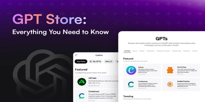
Looking to explore custom chatbots tailored to your needs? Discover how to access and use OpenAI's GPT Store to enhance your ChatGPT experience with specialized GPTs.

Want a smarter way to trade stocks in 2025? These AI tools help you find strong setups, cut out the noise, and make more informed moves with less effort
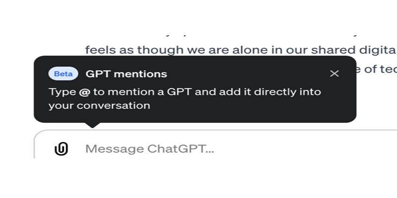
Curious about how to bring custom GPTs into your ChatGPT conversations with just a mention? Learn how GPT Mentions work and how you can easily include custom GPTs in any chat for smoother interactions

Ever wish your photo app could just understand what you meant? Discover how Google’s ‘Ask Photos’ lets you search memories using natural questions and context

Learn why exploding interest in GenAI makes AI governance more important than ever before.
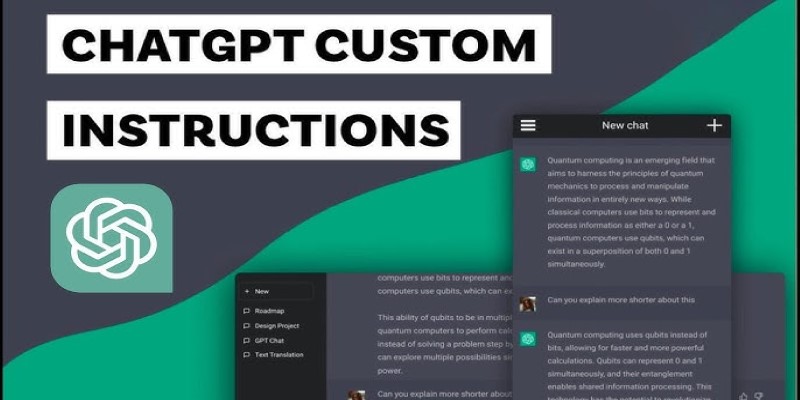
Want to make ChatGPT work better for you? Check out the five most effective ways to use custom instructions and personalize your chats for smarter responses

Trying to manage project timelines more easily? Learn how to create clear, customizable Gantt charts in Python with Matplotlib and Plotly, no expensive tools needed

Curious about AdaHessian and how it compares to Adam? Discover how this second-order optimizer can improve deep learning performance with better generalization and stability

Say goodbye to small coding errors and hello to GitHub’s Autofix. Learn how this AI-powered feature automatically finds and fixes bugs, saving time and boosting your code quality

From solving homework problems to identifying unknown objects, ChatGPT Vision helps you understand images in practical, everyday ways. Here are 8 useful ways to try it

Curious about CodeGPT? Learn what CodeGPT is, how it works, and whether it can really write code that runs. Simple guide for beginners and curious minds
Enhance your ChatGPT experience by using the Wolfram plugin for fact-checking, solving STEM tasks, and data analysis.